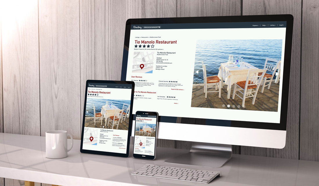
 Last year, more than 52 percent of all web traffic around the world came from mobile devices, according to Statista. Do your website’s visuals and text come across well regardless of whether a person is visiting your site on a phone, tablet, laptop or desktop computer? As Next Restaurants reports, if you have a traditional fixed website as opposed to a responsive one, your site’s images may be distorted or other content may get cut off altogether when people visit your site on a mobile device. What’s more, Google gives priority to responsive sites. You need one to ensure you’re appearing near the top of web searches. Once you convert your existing site to a responsive one or build a new one, ask an objective source to scroll through your site to ensure your graphics or other visuals don’t make navigation more difficult. Next Restaurants advises you give any important call-to-action items prime position on your homepage — email or loyalty program sign-ups, events or other key promotions should be easily viewable on a mobile device. While you’re at it, make sure your site is optimized for key words and SEO. Thanks to Google, consumers can make very specific searches on the Internet and get accurate results (research from the Hubspot indicates that 50 percent of web searches are four words in length or longer). That means your keywords should reflect that specificity. Instead of keywords as simple as “Italian food,” think “best Italian food in West Village.” For help, The Rail suggests using Google’s AdWords’ Keyword Planner to find popular search terms and to identify words and phrases that your competitors are using.
Comments are closed.
|
Subscribe to our newsletter
Archives
March 2024
Categories
All
|
 RSS Feed